Our aim is to keep CRM simple and we continually review our design alongside customer feedback to find more ways to improve the Capsule experience. This week we released some new designs to much loved features, here's a summary of what to expect next time you log in.
Search is even easier
Some customers loved the 'recently visited' information in Capsule, others didn't see the value, so we've kept the concept but designed it more intuitively. Now you have to click in the search bar to see the recently visited contacts. This move gave us more space to work with, so we added a person's image or company logo to the name displayed in search, making it even easier for you to recognize your contacts.

With search being such a powerful part of Capsule, we wanted to make it more noticeable so everyone can benefit. When you enter a keyword into the search bar, it scans notes and other logged activity, as well as contacts, opportunities, and cases. If you can remember a conversation you had, but not who it was with, no problem. Simply write the words from the conversation, and the note you're looking for will pop up instantly.

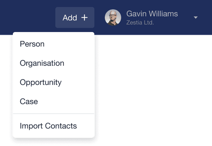
Another useful Capsule feature sometimes missed is the 'Add' button. It's a quick way to add people, organizations, opportunities, cases or, import multiple contacts to Capsule. We've made it more obvious in this release so everyone spots it straight away.
Faster forms, easier to fill
We're developing the technology we use to run Capsule so it's more responsive and works even quicker than before. This new technology makes it easier for us to enhance certain form features too, so here's what we've done.
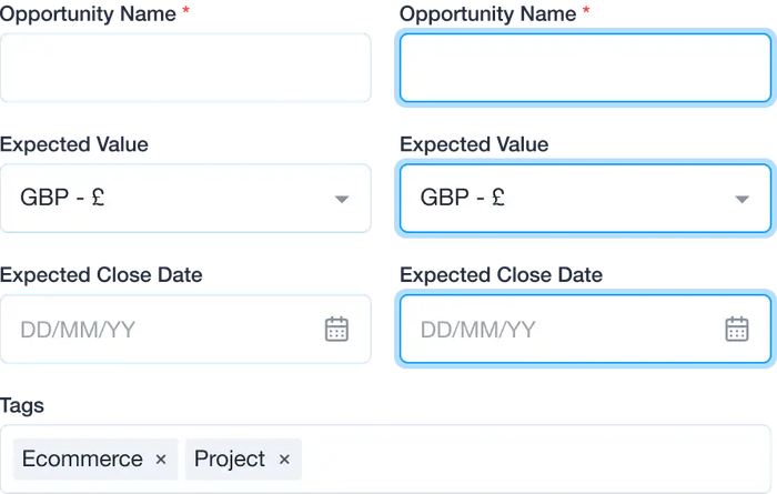
We've increased the size of fields on the new contact, opportunity, and case forms. This makes them easier to tap when you're working on a tablet or any other touch device. It also makes it more accessible for keyboard users as it's more obvious now when a field is selected and when you use the the tab key to go through the fields, it does so in a more natural order.
Tidier lists when creating new opportunities and cases
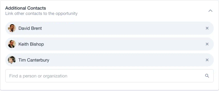
When you add a new organization, opportunity or case, we've improved the way you add additional contacts. Instead of a long list taking up lots of space, it's now an expandable list. When you preview the list, you see people's profile pictures so you know who is involved at a glance.
It's now also much easier to remove a contact from a list in an organization, opportunity or case. Simply hit the cross when you need to delete them.
Our custom fields and data tags work a similar way too - you can collapse or expand the sections whenever you need them.

Easier tagging
We've also refreshed the way tags look and work. Now you can add and remove tags while you're editing a record.

Create organizations wherever you are
When creating a case or opportunity in Capsule, it doesn't matter if the organization you link to doesn't exist in Capsule. You can add it straight from the form.

Press 'enter' to save
When you've finished updating your contacts, cases or opportunities, you simply press enter and it saves. This is supper useful for quick edits as you no longer need to scroll to hit save.
Everyone will see the updates to the opportunity and case forms but we're still updating the contact forms. We will release these when they're ready over the next couple of weeks.
We hope you like the new updated features and would love to hear your feedback.


