How to add Capsule to Looker Studio (formerly Google Data Studio)
Looker Studio integrates with Capsule so you can easily design your own reports based on Contact, Sales Opportunity and Project data from Capsule. Using the Looker Studio Connector means you'll have additional data points available that aren't usually available in Capsule, allowing you to create reports based on data such as the number of days it takes to close a deal.
You can combine those reports with other supported apps in Looker Studio to help you get a big picture view of your business from a range of data points.
Looker Studio is available to users on the Growth, Advanced and Ultimate plans, and if you don't already have an account you can sign up to Looker Studio here.
How to use the Capsule Looker Studio Connector
The begin using the Capsule Looker Studio Connector:
1. Login to Looker Studio.
2. Click Data Sources in the sidebar.
3. Click + in the bottom right to add a new Data Source.
4. Search for Capsule in the search box to easily find the available Connectors. There's a separate connector for Contacts, Projects and Opportunities.
5. Click on the one you'd like to use.
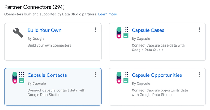
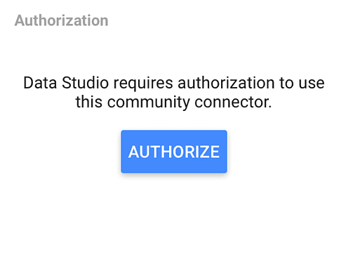
6. Click Authorize to allow your Google Account to use the Connector.
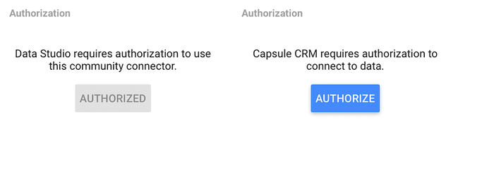
7. Click the second Authorize to allow the Connector to talk to your Capsule account.
8. If you're not already logged in, enter your Capsule subdomain and your login details to authenticate with your Capsule account.
9. Click Allow to allow the Connector to talk to your Capsule account
Once you're chosen the Capsule Looker Studio Connector, you'll be presented with some configuration options to choose if you would like to select custom fields to use as additional dimensions and/or metrics available for reporting.
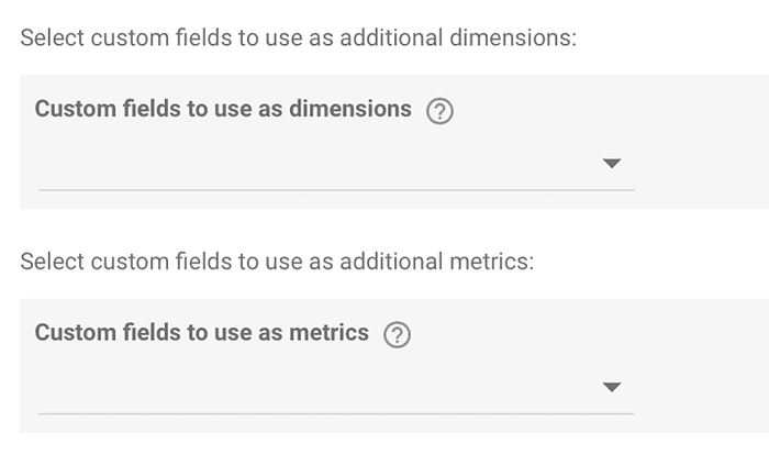
You can choose any number of custom fields which are available to use as dimension fields. As well as any number of custom fields which can be metric fields.
When you're configured the options as you like, you can click the Connect button in the top right to begin using Capsule as a data source.
Once connected, you will see a list of the available fields that you can use for creating reports. Fields in blue are metric fields, and those in green are dimension fields.
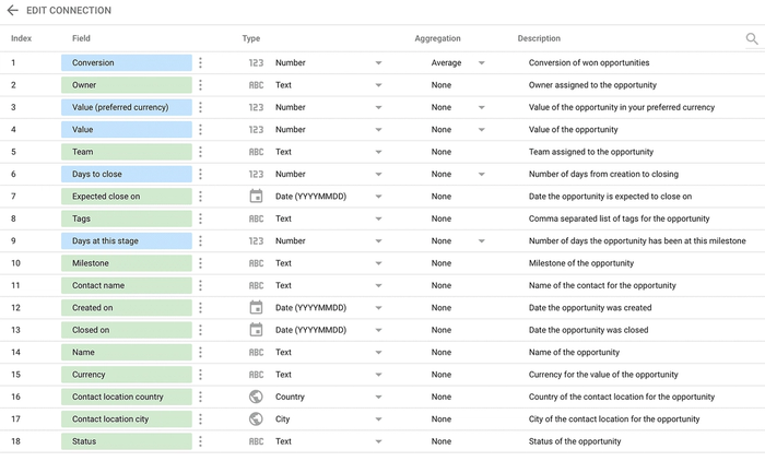
From here, you are able to click Create Report to create a new visual report based on your data. Alternatively, you can click Explore to go to the explorer to explore the data.
Changing Looker Studio configuration options
If you would like to change the configuration options you've previously set:
1. Click ← Edit Connection in the top left
2. Change any configuration options you would like to change
3. Click Reconnect in the top right

4. You will see a dialog which displays any new or missing fields which will be the result of adding and removing custom fields
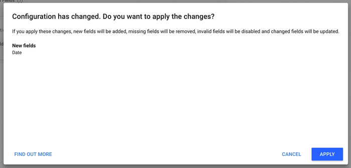
5. Click Apply to continue
You'll be taken back to the fields page, which will display your existing fields and then any new ones that may have been added.
How to create reports with Looker Studio
Time series chart for closed opportunity value
1. On the data source, click Create Report in the top right.
2. You will be prompted to add the Capsule source to the report.
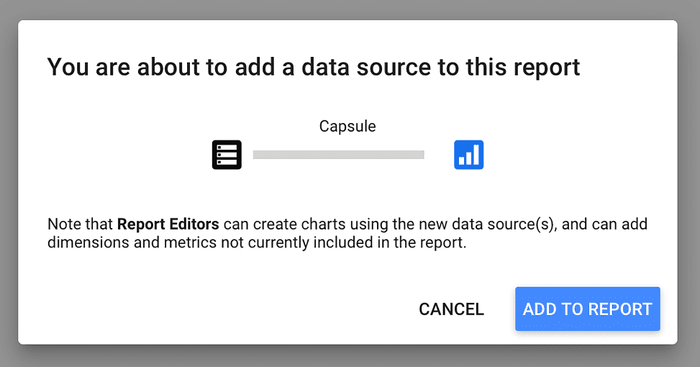
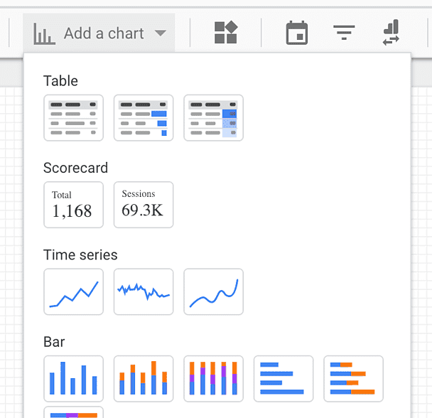
3. Click the Add a chart drop down and select time series.
Note: The chart may display a system error, this is due to it being unable to automatically detect the default date range, so we will change that below.
4. You will see the following default data settings for the chart.

5. Next, we will change the date range, to custom.
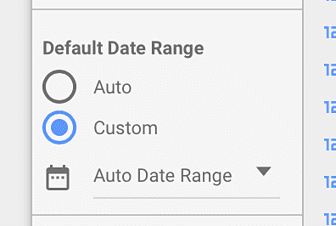
6. Click the Auto Date Range drop down to change the range to This year to date.
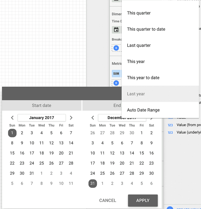
7. Click Apply to apply the date range change.
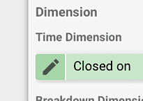
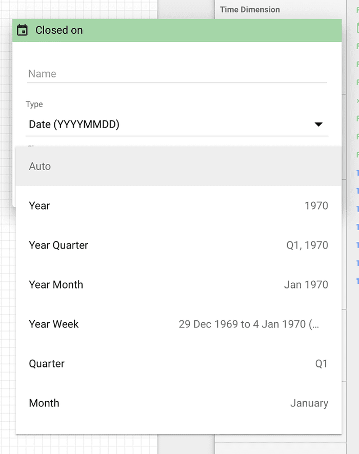
8. Click the icon to the left of Closed On so we can change how the date is shown.
9. In the Show as drop down, select Year Month.
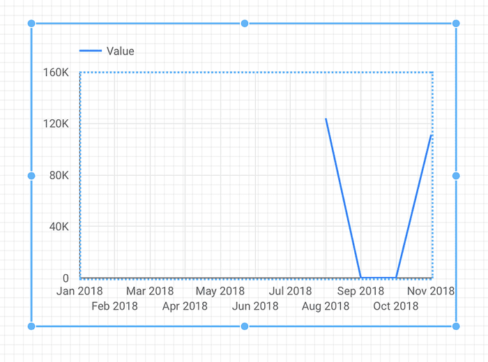
10. The chart will now show Closed Opportunity value for this year up to today.
11. We can also add a Breakdown Dimension to break down the data even more.
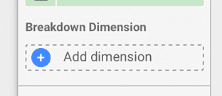
12. Pick Owner as the breakdown dimension
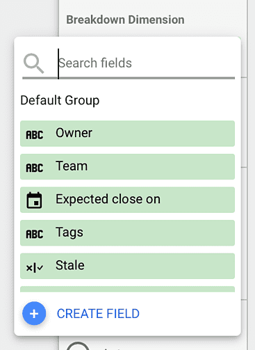
13. The chart will now break the data down by the owner of the Opportunities.
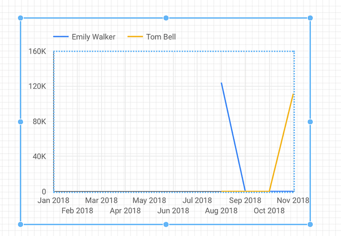
14. Now let's add a filter to only show data for Won Opportunities, at the bottom of the data column, find Time Series Filter.
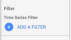
15. Click Add a Filter to create a filter for Won Opportunities.
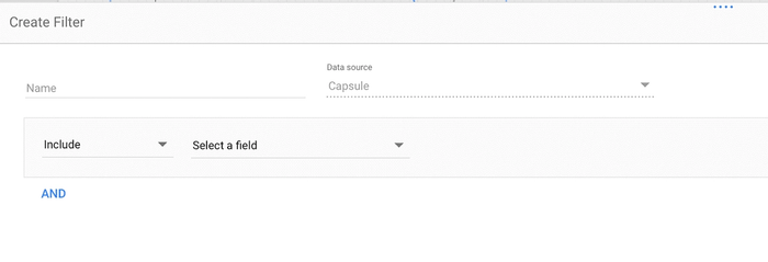
16. Select the Status field, the Equal to (=) condition, and enter the value Won.

17. Click Save to apply and use the filter. Now the chart will only be showing data for your Won Opportunities, and these filters can also be reused for other charts.
How to blend Contact, Project and Opportunity data
Blending Contacts with Opportunities
One of the benefits of our three connectors for Looker Studio is that you can blend the data from multiple data sources into a new data source, by joining them using the provided IDs.
To find out more information about data blending check out Google's own Looker Studio help article.
There is an ID field in the Capsule Contacts connector that allows you to blend the data source with Opportunities to get information about Opportunities linked to specific Contacts. Here's how to use it:
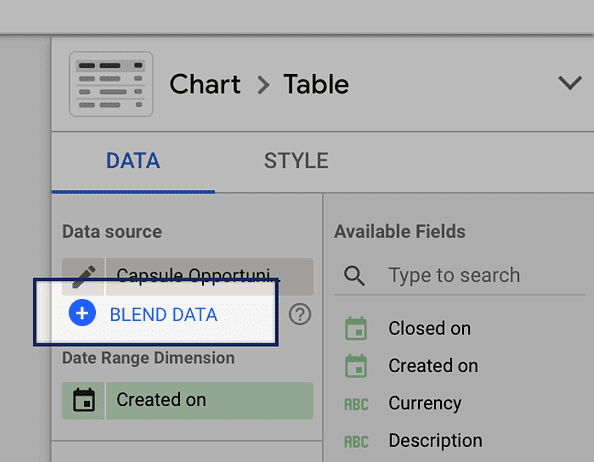
1. Under the data source for your chart on the right-hand side, select the Blend data item.
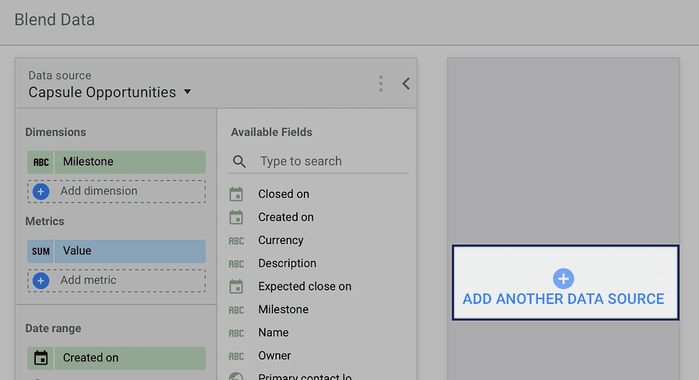
2. A new section will open up from the bottom. From there, use the option to Add another data source and depending on what is already there choose Capsule Contacts or Capsule Opportunities.
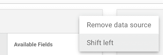
3. Before you go any further, you want to make sure that Capsule Contacts are on the leftmost side because this is the dataset that you'll be basing your blending on. If it's not on the left-hand side, then use the three horizontal dots next to the data source name and choose the option to Shift left.
4. Next, you will need to pick the fields to join the data on. This is the unique identifier that will match up the Opportunity with its related Contact. For the Contacts select ID and for the Opportunities select Primary Contact ID. This is the ID for the main contact linked to the Opportunity.

5. After that, you can pick the remaining fields that you want to be included in the report. Pick them and drag them into the relevant Dimensions and/or Metrics sections for each source.
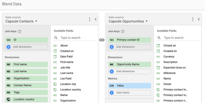
6. Once you've added all the required fields, you can give this blended data source a name on the right, then click Save to continue.
7. Click Close to close the section, and you're ready to configure your charts to use the blended data.
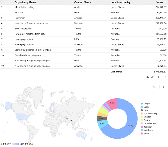
Below is an example report showing Opportunities for all Contacts that are tagged with VIP, with an attached map showing the breakdown by Country using the address for each contact and a pie chart indicating the Opportunity value percentage per Contact.
You can setup similar reports blending Contacts with Projects or Projects directly with Opportunities. If you need more help creating reports or have any other questions about Looker Studio, feel free to write to us directly on support@capsulecrm.com.