Over the past six months, we've been quietly migrating Capsule to a new application architecture. Whilst you might not share the same excitement for web technologies that we do, you'll be pleased to hear that this gives us greater flexibility when making improvements in the future. It allows new functionality to be delivered faster and enables a more seamless user experience that wasn't previously technically possible. The change has already facilitated improvements to contact lists and the opportunity pipeline, today we’d like to announce a few more changes.
A Better Calendar
Our new application architecture empowers us to build interfaces that are faster and more productive than before. Consequently there's a number of areas where we've identified opportunities for improvements, the first of which are on the calendar. With these changes we wanted to build on the straightforward look and feel while strengthening task management and navigation.
The new calendar also loads faster. To improve the performance of the calendar we had to limit the number of tasks displayed in a month. This has the added benefit of reducing the clutter on screen, so you can get a sense of the month ahead and plan in more detail using the new week view.
Improved Navigation
Something we know wasn’t as simple as it could be was navigating between months and years. This is now made easy with a new year and month picker.
Video showing how to navigate to the calendar in Capsule
You can still use the arrows to navigate from one month to the next, or you can use the menu to quickly switch between month and year. You can always hit today to return back to today’s date.
Drag and Drop
Moving tasks around your calendar has always been simple but we’ve now made it easier to move your tasks between months and even years.
Video showing dragging and dropping of tasks in the Capsule calendar.
Any selected day will remain selected as you navigate to different months and years. You can then drag tasks from the sidebar to a new due date or move tasks to the selected day by dragging from the calendar to the sidebar.
Week View
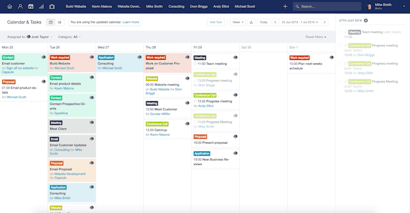
We know that its important to be able to get an overview of all the tasks you have on any given day. So, alongside the month view we've added a new week view to help you plan the week ahead.
This view allows you to navigate through your tasks, week by week, while maintaining a selected day in the sidebar to allow you to easily move tasks between weeks and months.
Tasks
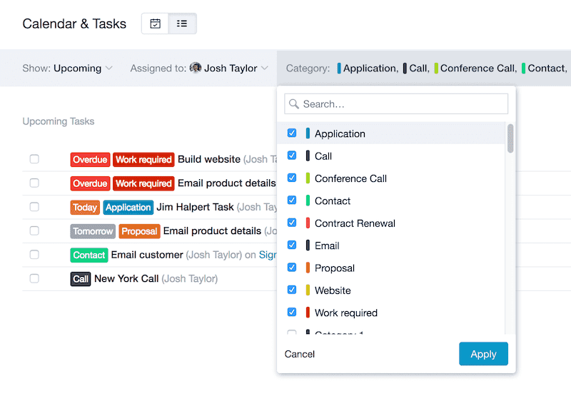
Filtering your calendar and tasks list has been made more powerful.
Both owner and category filters have been improved to allow you to search for the owner or category you’d like to filter by, while also allowing you to be able to filter by multiple categories.
We hope you enjoy these latest updates! Over the coming months we will be listening to your feedback to make further improvements to your Capsule experience. Any questions please let us know if you have any thoughts or questions.
